
Doorstep
Helping first time buyers understand what they are looking at.
- Role
- Product designer
- Timeline
- 8 weeks
- Team
- 2 engineers, 1 PM, me
- Platform
- Web

A product that worked and made no sense
Doorstep helps first time buyers see whether they can afford a home and what happens next. When I joined, the product worked in the technical sense and made almost no sense to the people using it.
I talked to buyers who were stuck, mapped where the interface was losing them, and found that the same pattern repeated on every screen: jargon first, explanation never.
Starting with a map
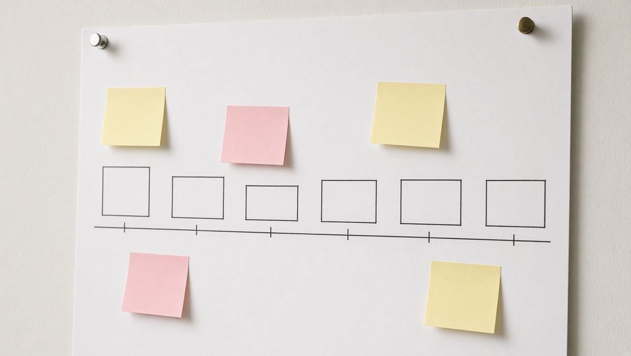
Buying a home has more steps than anyone expects, and most are done by someone else. So the first thing I drew was not a screen. It was a plain timeline of the whole process, from the first afternoon on a property site to getting the keys.
That drawing became the spine of the product. Every screen answered the same three questions: where am I, what is next, and what do I need to do now?
Jargon, translated
We kept every legal and financial term, because buyers will meet them anyway. But each one now has a short, friendly definition beside it and a single example. Words like "exchange" and "completion" stopped being a barrier.
I also helped set the first brand direction for the product, which gave us a calm, confident voice to carry all of this.
What happened next
The redesigned flow went live after eight weeks. More people finished the affordability check, and the support team reported fewer calls from buyers who were unsure what a screen meant. The timeline became the most visited page in the product.